Identity · Brand book
Corporate identity for a dynamic construction company. Logo, color system, typography, media - and a case explaining why the blue color leads the eye from the earth to the sky.
Brand platform
Before drawing a logo, you need to understand what the company wants to convey. This is the foundation from which the entire visual system grows.
Quality
Quality as a commitment, not a marketing claim. Every element of the identity must be flawless.
Safety
Safety is the main value of the construction business. Visually: stability, clarity, reliability of forms.
Sustainability
Sustainability and a long-term view. We don't build quickly - we build to last.
Innovation
Moving forward. That is why the logo is dynamic, with a slope - and not static and conservative.
Task
Siberia Construction is a dynamic construction company that wanted to establish itself as an innovative market player. There was no existing image at all - the company operated without a corporate identity, which in the B2B construction market is immediately read as a lack of trust.
Task: to create an identity that conveys strength and movement - and at the same time works on all media of the construction company: from facade signs to workwear, from business cards to billboards at a construction site.
Additional complexity: the company operates in international markets, so everything - logo, brand book, case - was done in English.
The colors trace a building’s path—from ground to sky
The logic of the Siberia Construction color system: from dark to light, as the building grows upward
Brainstorm
Construction companies mostly look the same: yellow or orange, square frame, font without character. Yellow represents everyday associations with paint and hard hats, orange represents road work. I wanted the brand to break away from that pattern.
I studied international construction brands that position themselves as premium: Skanska, Bechtel, Vinci. They all use blue. Blue in construction is not bank reliability, it is the sky as a horizon of possibilities.
Refusal of yellow
Yellow and orange are the visual standard of the construction market. Using them means disappearing among competitors. Blue against this background is a bold, differentiating choice.
Metaphor of growth
The gradation of blue - from dark (#0D1B2E) to light (#4DA3FF) - literally describes the construction: from the foundation in the ground to the facade open to the sky. Color tells a story without words.
Dynamics in the logo
The letter S with a slant, italics, an exclamation mark as a final accent - all this creates a feeling of movement. Construction is not about standing still, it is about moving forward.
Three versions of the logo
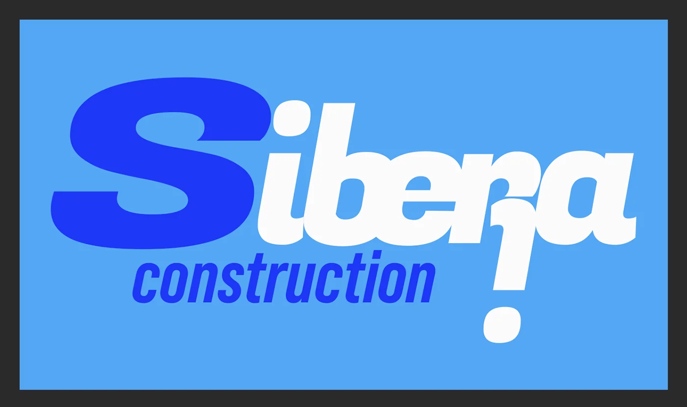
Main (full color on blue), contrast (blue on white), monochrome (white on dark). A construction company works on different media - the logo must be readable on concrete, workwear and a screen.
Logo
Dominant letter S
S is an initial that carries a double meaning: Siberia and Steel (steel). The size of the logo is intentionally larger than the other letters - the company is confident in itself and is not hiding.
Italic Slant - Movement
The slant of the font creates the effect of forward movement. The construction company is building the future - the logo visually confirms this. A static roman font would be inappropriate here.
Exclamation mark as a signature
The exclamation point at the end of “construction!” - this is character. Not just any construction company, but one that does it with energy. An unconventional device for a conservative industry, which is memorable.
Fonts: Belop Family + Fogaz One
Belop Family is a basic text font that is readable and neutral. Fogaz One is a logo font with character, angular and confident. Two roles, two tools.
Color
Four shades of blue - from almost black to heavenly. This is not just a palette, this is the history of construction: the dark foundation goes into the ground, the light facade looks into the sky. Each color takes its place in the hierarchy of media.
Ground
#0D1B2E
Foundation · background · dark media
Steel Blue
#1A63D8
Main · logo · accent
Sky
#4DA3FF
Light accent · letter S · details
White
#FFFFFF
Text · reverse version
Typography
The principle is the same as for any strong brand: one font with character for the sign, one neutral font for the texts. But in construction, technical readability is also important - the font must work on the construction site, and not just on the screen.
Fogaz One - logo
A distinctive display font with angularity and energy. Italic style emphasizes movement. Used exclusively in the logo - it is the brand’s dedicated display typeface.
Logo only display
Belop Family - everything else
Geometric sans serif with high readability at any size. Works on letterhead, in a presentation, on a sign. Multiple styles allow you to build a clear typographic hierarchy.
Headings · captions · text
Application
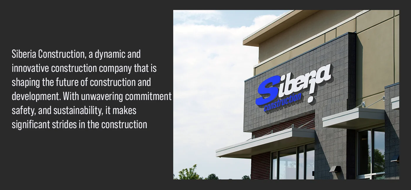
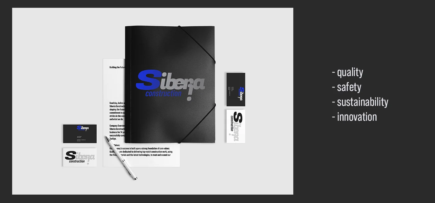
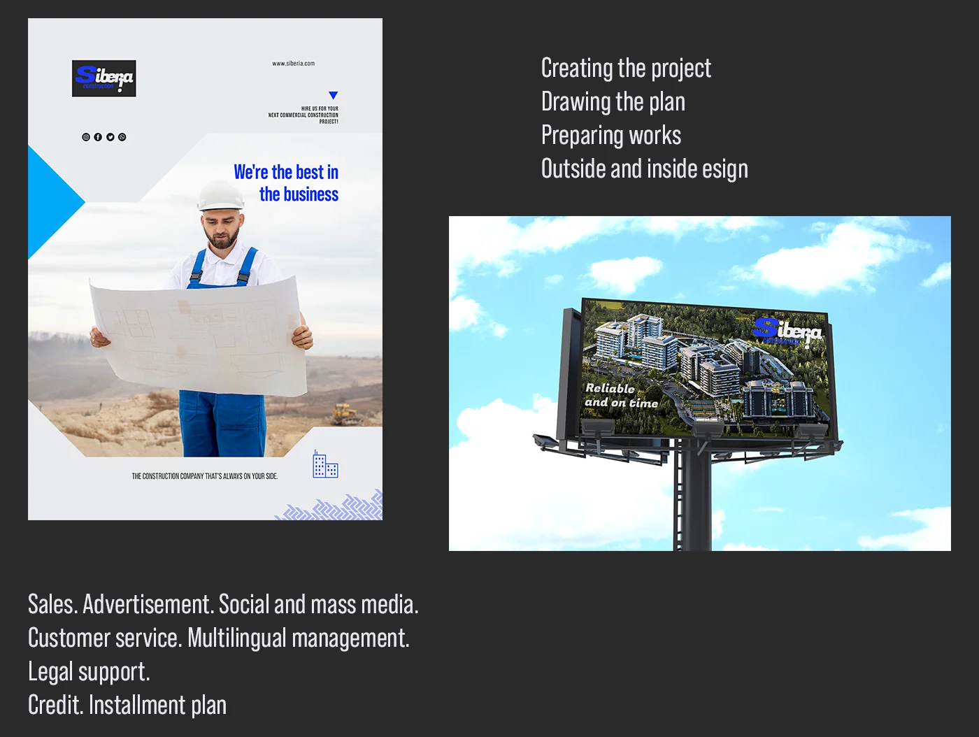
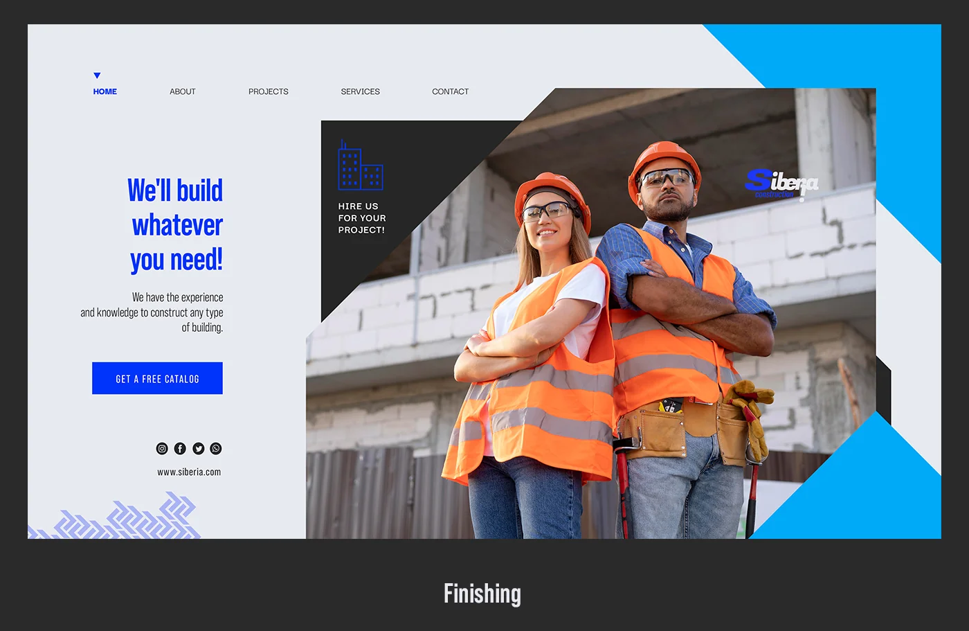
A construction brand is defined by its applications. Here, not only paper media is important, but also how the logo looks on the facade of the building, on equipment, on workers’ uniforms and on a billboard near a construction site. Each version of the logo is tailored to its own context.
Process
Unlike projects with a household audience - restaurants, personal brands - a construction brand must work in harsh conditions: bright sunlight on the facade, dirt and dust on equipment, small size on documents. This guided every design decision.
The process began not with visuals, but with positioning: who the competitors are, what they look like, where the market leaves room to stand apart. The yellow-orange segment of the market is occupied - the blue one is free. This was the first and key choice.
Next, the logo was tested not on a blank sheet of paper, but immediately on real media: the façade of a building, a billboard, workwear. A logo that looks good in Illustrator may fail on concrete. This one passed every test.
Outcome
A complete visual system for a construction company with international ambitions: logo in three versions, color palette with conceptual logic, typographic pairing, six media categories.
The main result is a brand that stands out in a conservative industry without losing credibility. Blue differentiates, the dynamic logo conveys energy, and the four values provide a platform for further communication.
The case is designed in English - the company can use it for presentation to international partners and investors without adaptation.