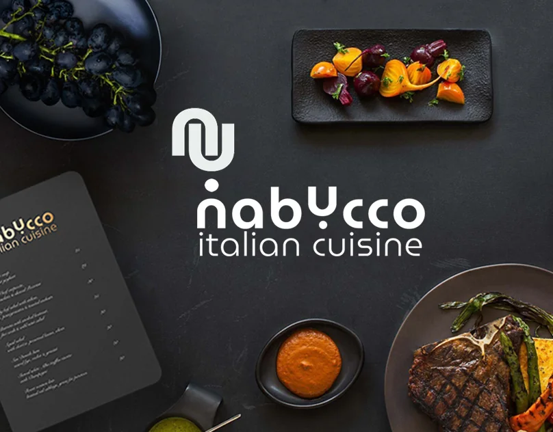
Identity
Corporate identity for an Italian restaurant in Alanya. Logo, color system, typography, media and SMM materials - from scratch to a full-fledged brand.
Task
The Italian restaurant Nabucco opened in Alanya from scratch. The owner, Flavio di Marki, is an Italian who has long dreamed of opening a restaurant in Turkey. There was nothing ready-made at all: no logo, no colors, no understanding of the visual image.
Task: to create a full-fledged brand from scratch. It had to convey real Italian cuisine, while working in a Turkish context and not look like just another pizza place with the Italian flag on the sign.
«It was my dream — to open my own restaurant in Turkey. Now the dream came true»
Flavio di Marki, owner of Nabucco Italian Cuisine
Study
I started with an analysis of competitors in Alanya - most Italian restaurants use predictable solutions: a red and green palette, pizza in the logo, “Italian” typography with serifs. All this has long since depreciated.
I studied modern Italian brands in Europe - there is a trend towards laconicism, geometry, orange and terracotta shades. These are the colors of Italian architecture, sun, terracotta - real Italy, not a tourist cliché.
Competitor analysis
Collected 20+ Italian restaurants in Alanya and Europe. I identified patterns that need to be avoided and blind spots where you can go.
References and mood
I put together a mood board: modern Italian architecture, terracotta, geometric patterns, street markets of Naples. Confirmed with the client.
The name as a concept
Nabucco is an opera by Verdi, a symbol of Italian culture. The name already carries history and character. This became the conceptual anchor.
Target audience and context
A restaurant in Alanya has a mixed audience: tourists, Europeans and locals. You need to work for both groups without losing character.
Logo
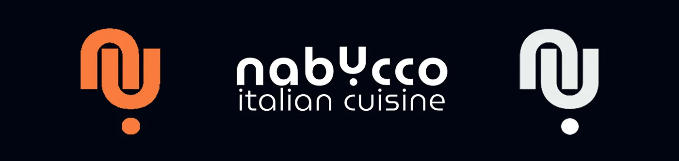
The logo is based on the monogram “NU” - the first letters of Nabucco. The shape of the sign is geometric, with a characteristic fracture that refers to the architectural elements of Italian buildings. The sign works both as an independent symbol and in conjunction with lettering.
The lettering "nabYcco" is a deliberately non-standard spelling with a capital Y in the middle. This is a visual trick that makes the name memorable and creates personality even in a text block.
Color palette
Nabucco Orange
#E8531A
Primary accent
Espresso
#1A1008
Base background
Cream
#F5F0E8
Light background/text
Typography
Two fonts with clear roles: one for headings - characteristic, with personality. The second is for text - clean, functional. Both work together on all media.
MuseoModerno
Title font. Geometric grotesque with rounded shapes - modern but warm. Used for logo, menu headings, signage.
Myriad Pro
Text font. Neutral sans-serif with good readability. Used for descriptions of dishes, captions and tags in social media materials.
Pattern and graphics
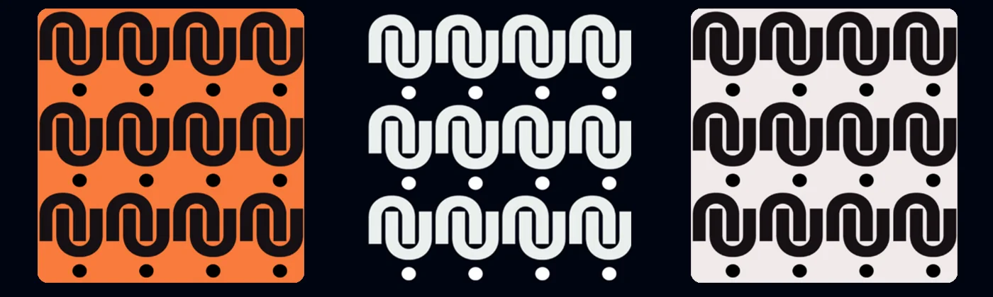
The key element of the identity, in addition to the logo, is a geometric pattern based on the NU monogram. The pattern is built from repeating characters and is used on packaging, media, and backgrounds of SMM materials.
The pattern works as a recognizable element of the system and allows you to quickly transfer the identity to different media without overloading the layout.
SMM materials
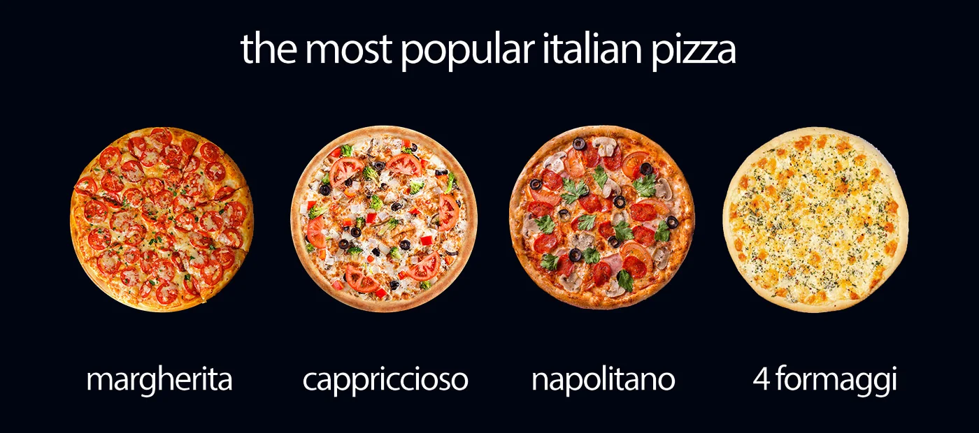
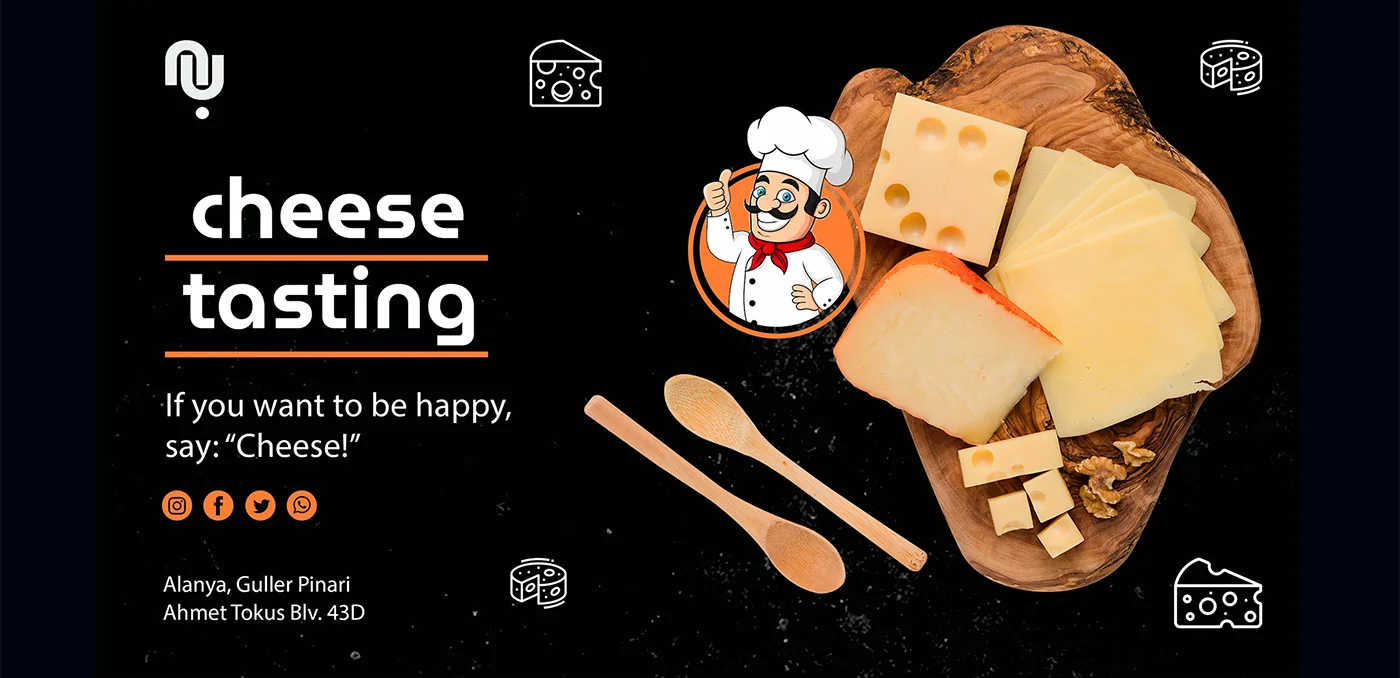
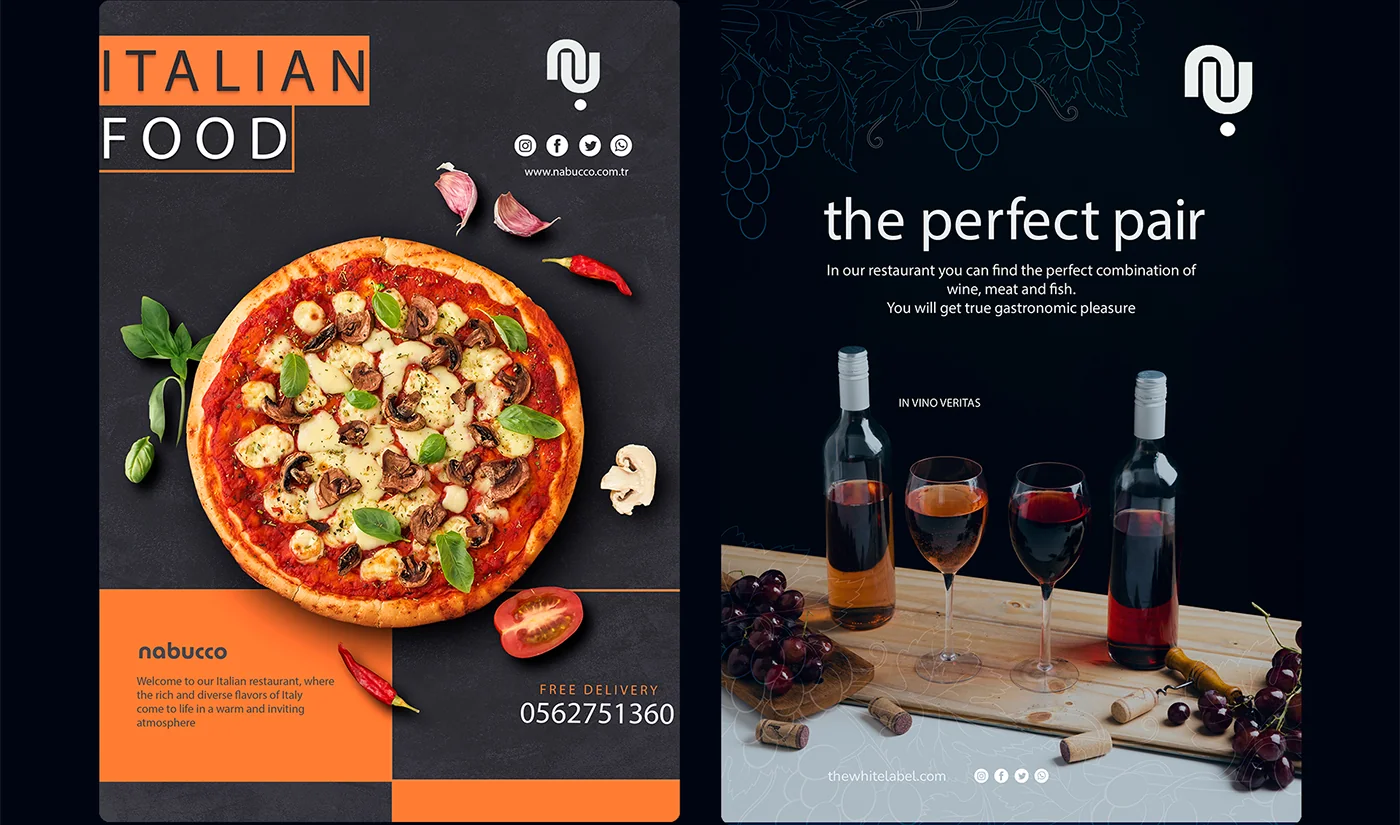
Developed a template system for Instagram. Each post follows a grid: an area for a product photo, an area for text, a logo in a fixed position. This allows the client to create content independently without losing their corporate identity.
Applications
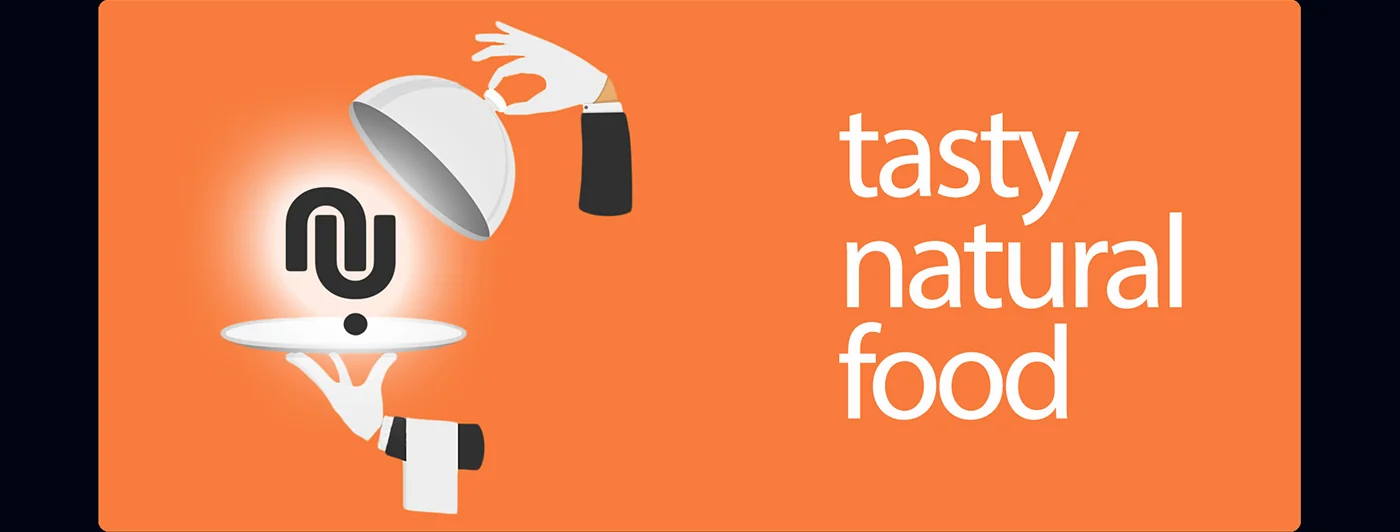
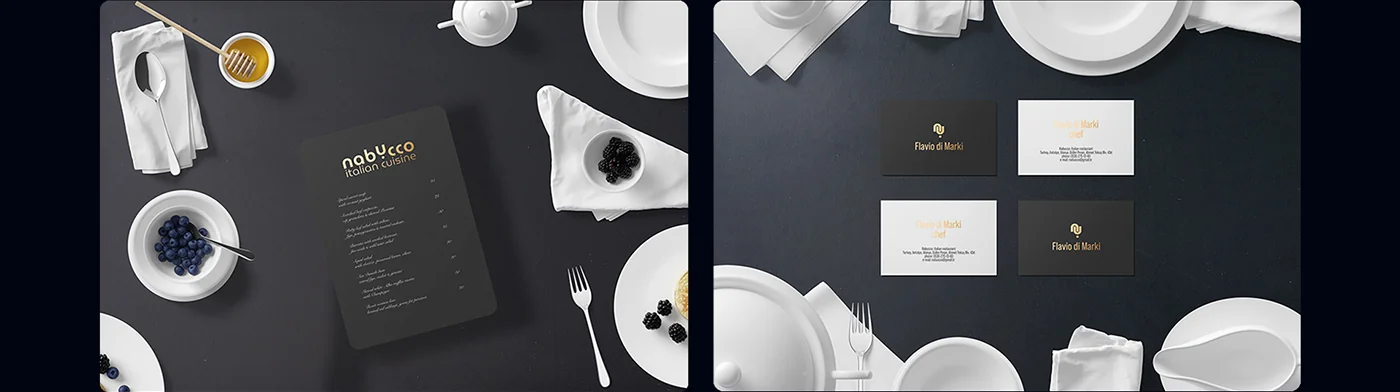
The corporate identity is applied to all physical and digital media of the restaurant. A single system works from a business card to a façade sign.
Result
A complete identity from scratch: logo, monogram, color system, typography, ornament, templates for SMM and rules for use on media.
The main thing is that the brand does not look like another Italian restaurant in a tourist city. It has character, consistency, and recognition. The orange-dark palette stands out in the feed and on the street among competitors with predictable red-green.
The client received not just a logo, but a ready-made system that can be scaled to new locations, new media, new content formats.