FORTRESS

Website & Brand Book

Fortress Investment

Fortress Investment is an investment project in the real estate sector. As part of the work, a website with a property catalog, navigation and filtering, as well as a brand book with a visual system, submission rules and presentation materials were compiled.

Client

Fortress Investment

Year

2024

Type

Website · Identity · Brand book

Volume

Website + 37 pages

WebsiteCatalogFilteringLogoBrand bookReal estate

Website

Website and property catalog

A website with a clear navigation system and a real estate catalog was developed for the project. The user can search for properties by destinations and regions of Turkey, including Alanya, Mersin, Istanbul and Antalya. The structure of the site helps you quickly move from general interest to a specific object: select a region, filter offers and evaluate the project without unnecessary visual noise.

Navigation by region

Alanya, Mersin, Istanbul and Antalya are presented in a clear structure so that the user does not get lost in the catalog.

Property filtering

The catalog is designed for quick search by parameters and scenarios for choosing real estate.

Investment-focused presentation

The site should not just show objects, but explain the value of the destination and help make a decision.

Visual cleanliness

The interface is based on large typography, a calm grid and accent elements without overload.
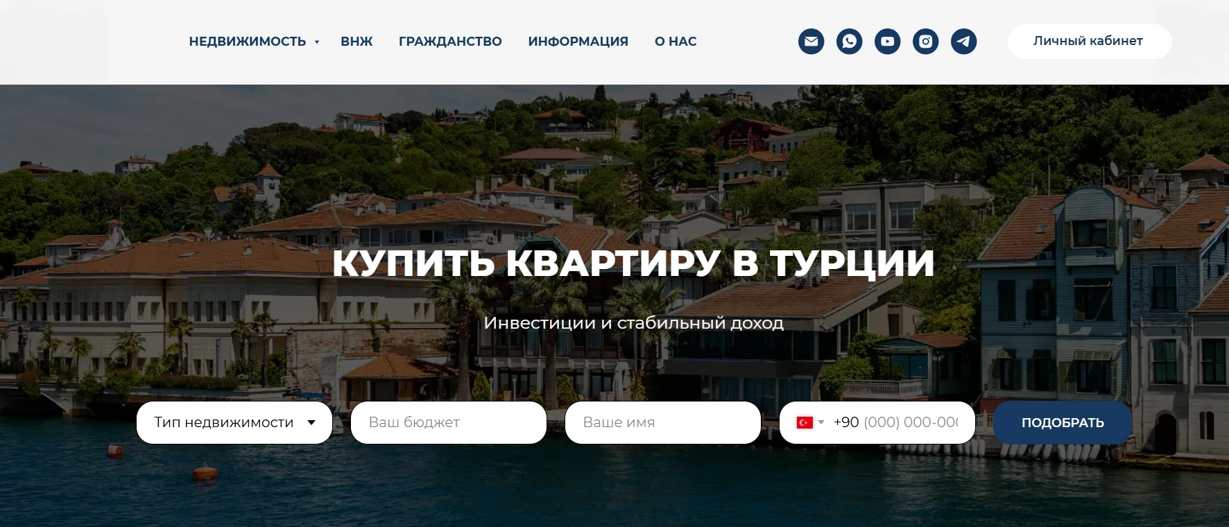
Fortress Investment - website and property catalog

Brand book

Brand book and visual system

A visual system was assembled separately for Fortress: brand logic, typography, color base, composition rules and design of presentation materials. The brand book records the style of the project and helps maintain a consistent character at all points of communication.

Fortress Investment - brand book and visual system

Task

Starting point

Fortress Investment real estate agency operates in Alanya and specializes in investment properties for foreign buyers. The company entered the market from scratch: without a logo, without a visual system, without a defined brand image.

Task: to create a full-fledged identity and put it into a brand book. It is important that the brand must operate in three languages: Russian, Ukrainian and English, look premium and convey key values: reliability, protection of client interests, professionalism.

Brainstorm

Concept exploration

I started by looking at the name. Fortress - fortress. It is a metaphor for protection, resilience and trust. Investment - investment, capital growth and strategic approach.

Studied competitors in the Turkish real estate agency segment. Most use standard solutions: house, key, minimalistic font and blue color. Blue suits the industry, but a stronger image system was needed.

01

Fortress metaphor

The shield as a central symbol is the protection of the client’s interests. The battlements of the tower from above give a recognizable silhouette.

02

Grapheme "F"

Inside the shield is the letter F from Fortress. This is both a symbol of the brand and an image of the gates of the fortress.

03

Balance of rigor and flexibility

Rounded elements soften the rigidity of the geometry and symbolize loyalty in work.

04

Blue like an anchor

Deep navy is associated with reliability, architecture and the sea, which is important for Alanya.

Logo

Concept and symbolism

Fortress - concept and symbolism

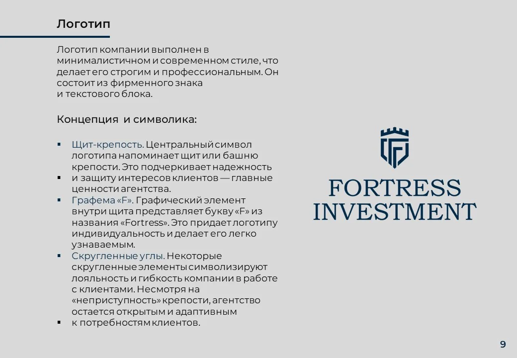
Shield-fortress

The central symbol resembles a shield or tower of a fortress. It emphasizes protecting the interests of clients.

Grapheme "F"

The graphic element inside the shield is the letter F from the name Fortress and the image of a gate.

Rounded corners

Severity without coldness: the sign remains premium, but not repulsive.

Bookman Old Style

Classic serif emphasizes the premium, confidence and monumentality of the image.

Color palette

Fortress Navy

#002948

Main background

Fortress Blue

#163962

Additional

Light Gray

#F4F4F4

Light background

Near Black

#0E0E0E

Monochrome

Blue - reliability and professionalism. White - transparency of transactions.

Logic of the Fortress Investment color system

Typography

Font system

Two fonts with strict roles. No confusion: each font knows its place in the hierarchy.

Bookman Old Style - logo

FORTRESS
INVESTMENT

Classic serif font. Used exclusively in the logo.

Montserrat - all texts

Agency
real estate

Geometric sans serif for headings, subheadings and body text.

Pattern

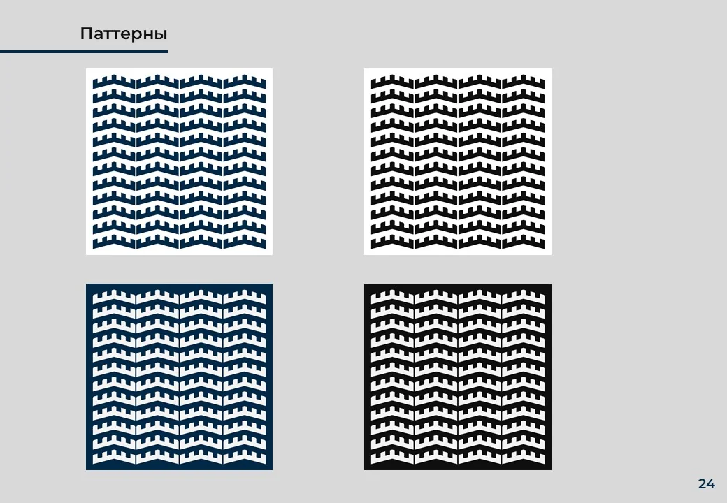
Ornament from the battlements of the fortress

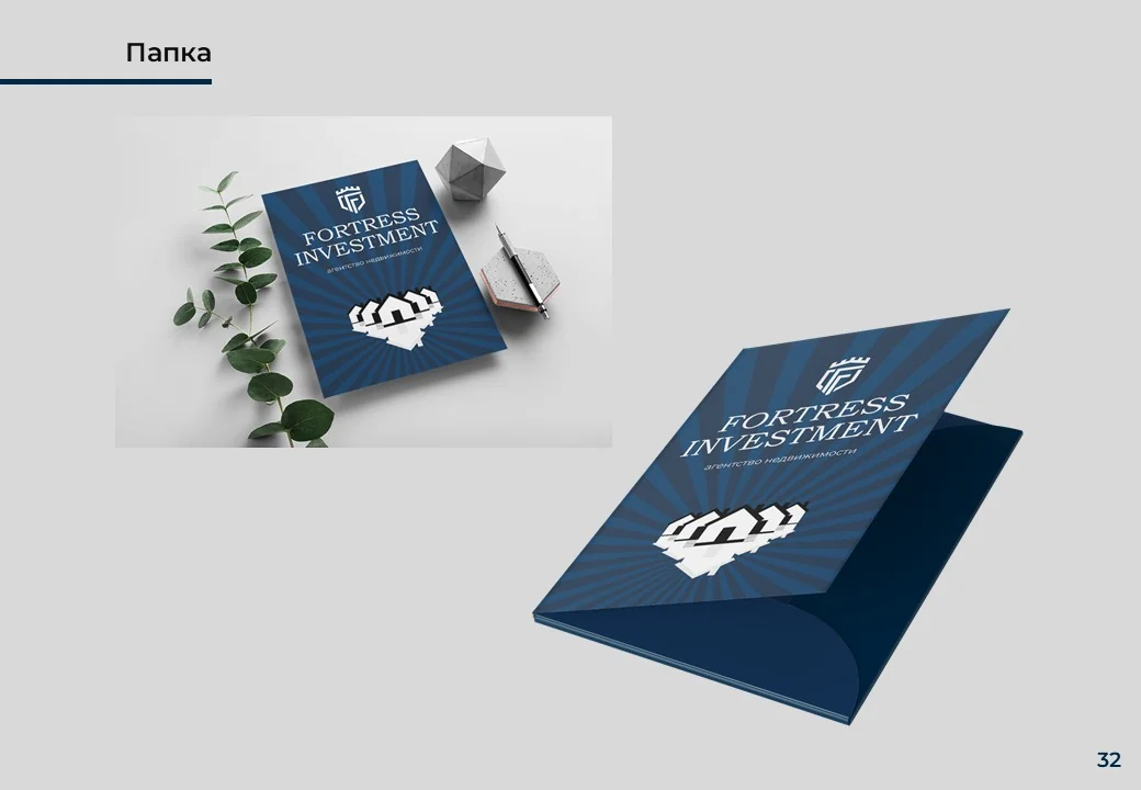
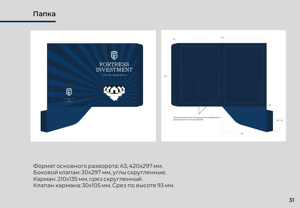
The pattern is a repeating fortress battlement motif taken from the top of the logo. It is used on packaging, folder and media.

Fortress - pattern

Applications

Corporate documentation

All media are built on the same principle: a dark blue block with a logo and a light area for content.

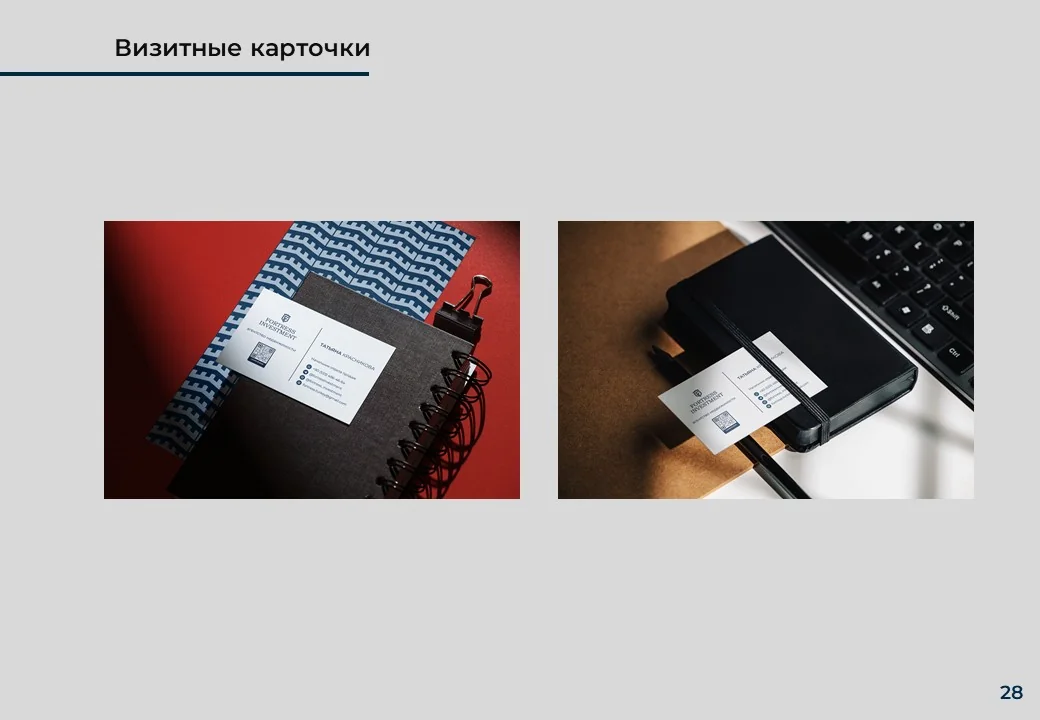
Business card90×50 mm 4+4 CMYK matte lamination
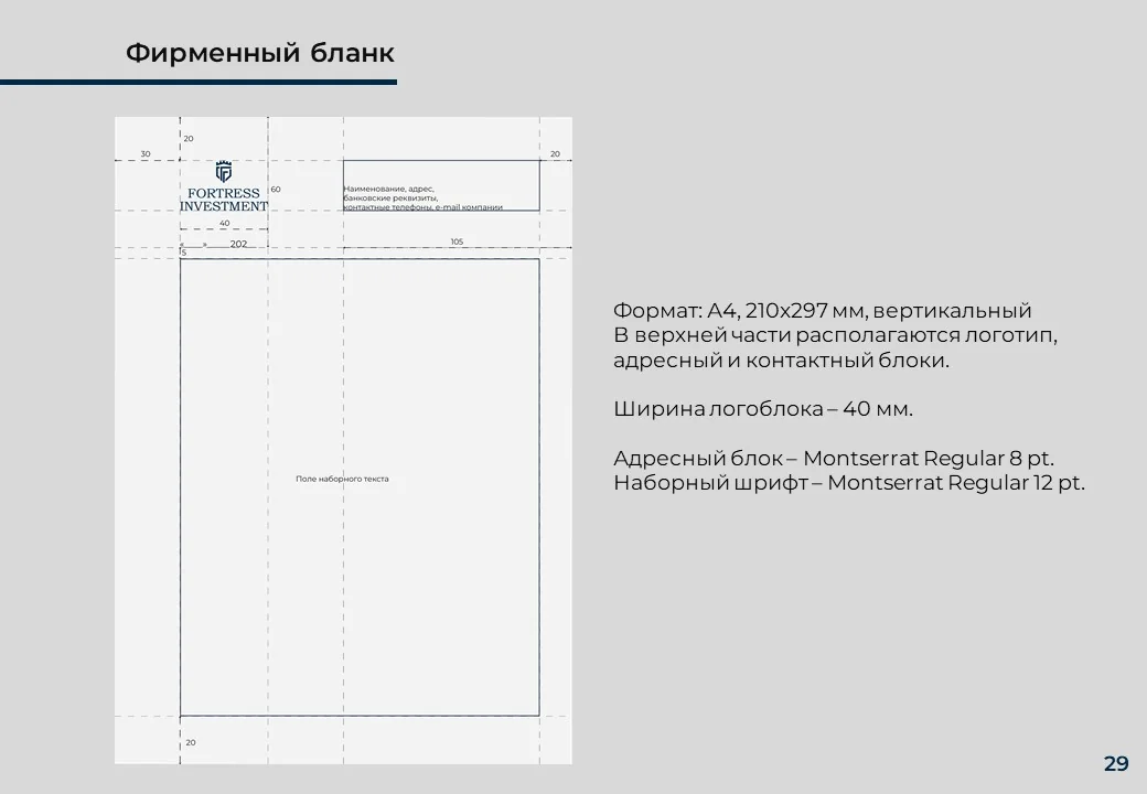
LetterheadA4 · color and monochrome version
FolderA3 spread · cover pattern
PenBranded merch with logo
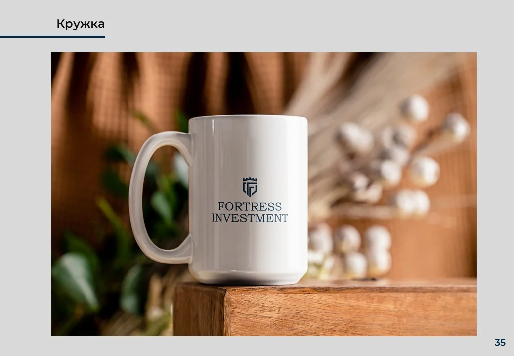
MugOffice and corporate gifts
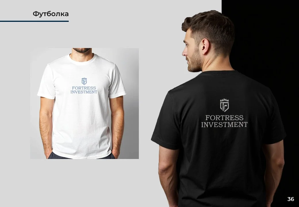
T-shirtWhite and black versions
Fortress - business cardsFortress - letterheadFortress - branded folder
Fortress - folderFortress - mugFortress - T-shirts

Rules

What not to do with a logo

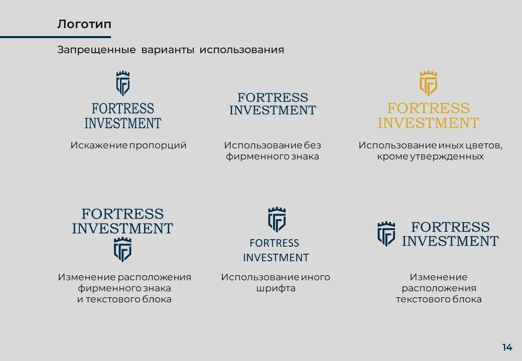
A separate section of the brand book contains prohibited options. 6 errors are described: distortion of proportions, use without a sign, unapproved colors, changing the arrangement of elements, replacing the font, horizontal placement.

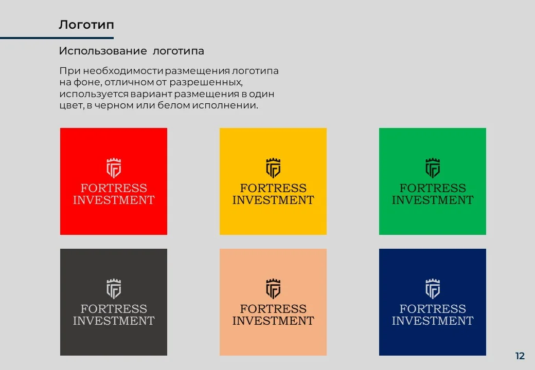
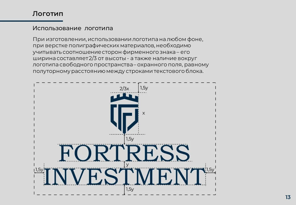
Fortress - color optionsFortress - clear spaceFortress - logo rules

Result

Outcome

Complete visual system: logo in three versions, color palette with precise codes, typographic system in three languages, pattern and six media categories.

The 37-page brand book is a working tool. The contractor will be able to accurately reproduce the corporate style without unnecessary guesswork.

The main achievement: the brand looks like an international agency, rather than a local firm.

Fortress - final spreadFortress - logo on the wall